Google fonts are everywhere—Noto Sans, Lato, Montserrat, Nunito, Open Sans, Raleway, and Work Sans are some of the most popular1. Google Fonts’ search results prioritize web usage, so popular fonts surface first. There’s nothing wrong with a well-loved font—most popular fonts are good readable typefaces with consistent spacing, varied in family styles, and supportive of a multitude of world languages— and they work. But when I have a specific aesthetic in-mind, Google Fonts’ search filters lack granular options for discovery. If I search for something like a “grotesque” or “grotesk” inspired font, I better hope the exact word is in the font’s name because the search only returns keyword matches.
So, I’m keeping this running list (in no particular order) of typefaces available through Google Fonts for myself: sans-serif fonts stylish enough to encapsulate brutalist aesthetics and rational enough for long-read passages.
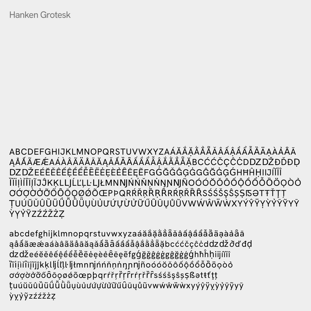
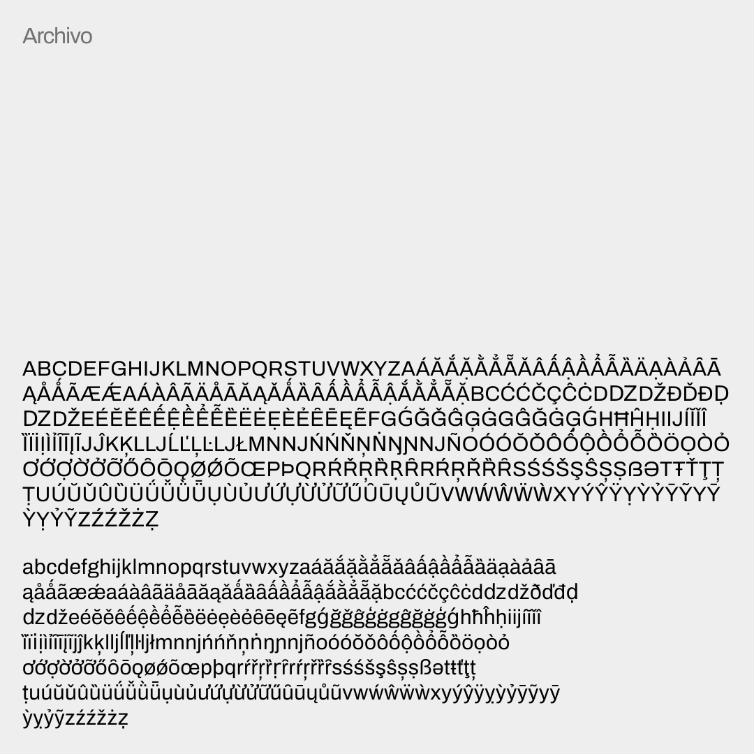
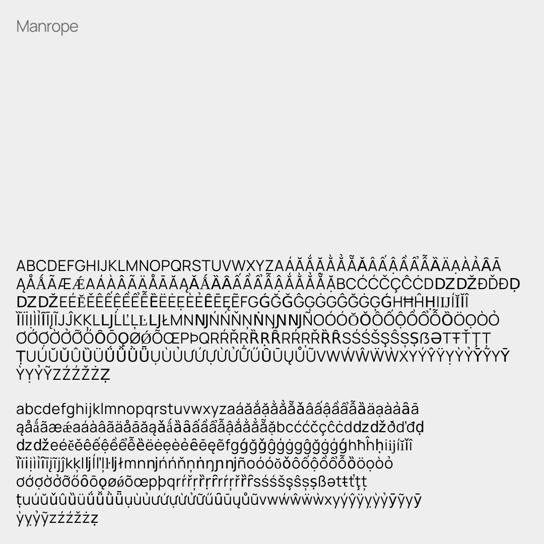
Some glyphs are swapped with a fallback, meaning the glyph isn’t supported currently
Hanken Grotesk
This is typeface is inspired by the classic grotesquese typefaces and features some geometric influences in the bezier curves. It reminds me a little of Akzidenz Grotesk and Museo, particularly in the lowercase “L”.
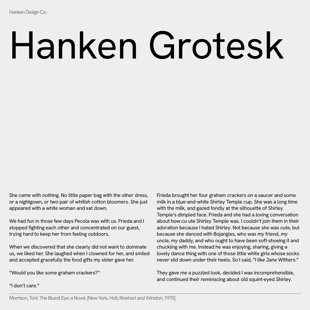
Project led by Alfredo Marco Pradil, Hanken Design Co.
Archivo
Derived from Chivo and originally designed for highlights and headlines, this font is a highly-performant font that works simultaneously on print and web.
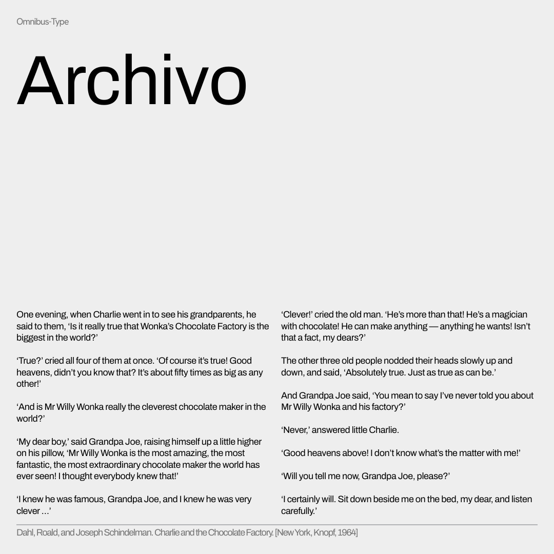
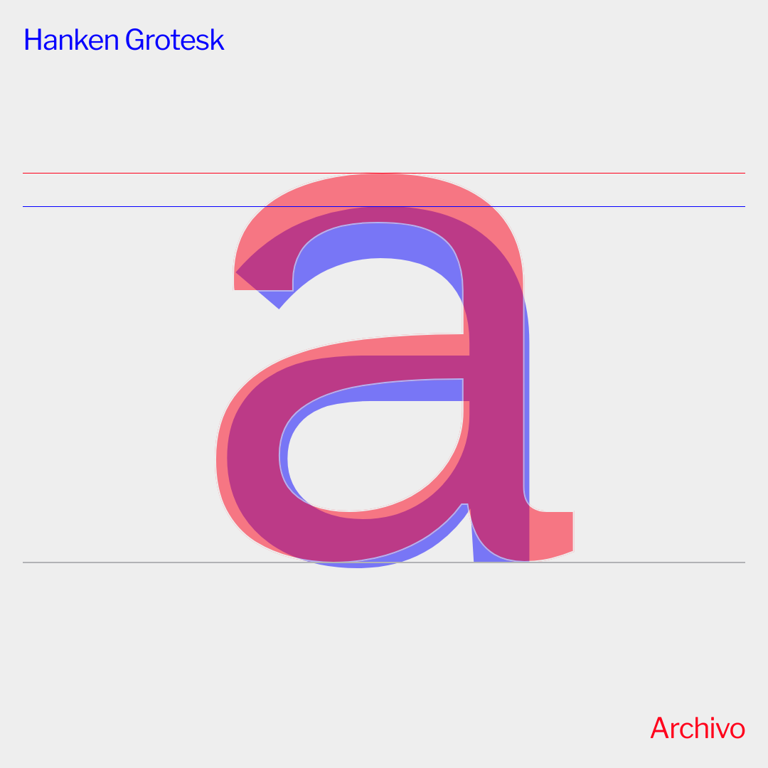
Designed by Héctor Gatti, Omnibus-Type
Manrope
This variable font is “a crossover of different font types: it is semi-condensed, semi-rounded, semi-geometric, semi-din, semi-grotesque.”
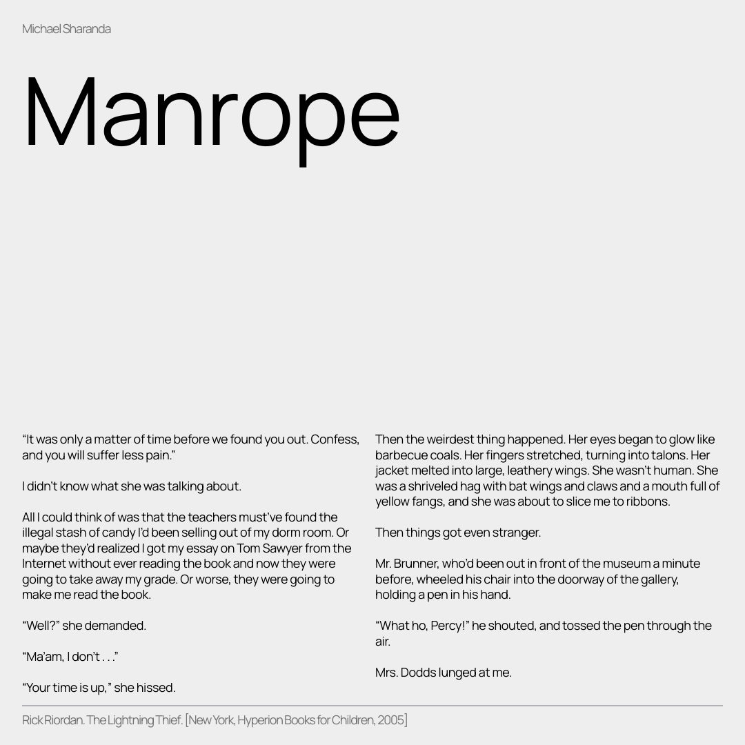
Designed by Michael Sharanda, Gent
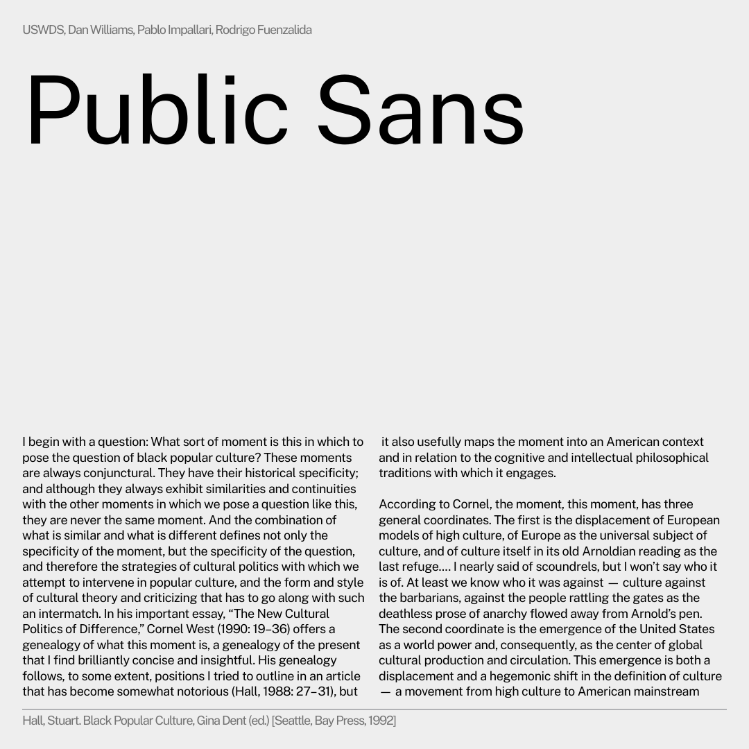
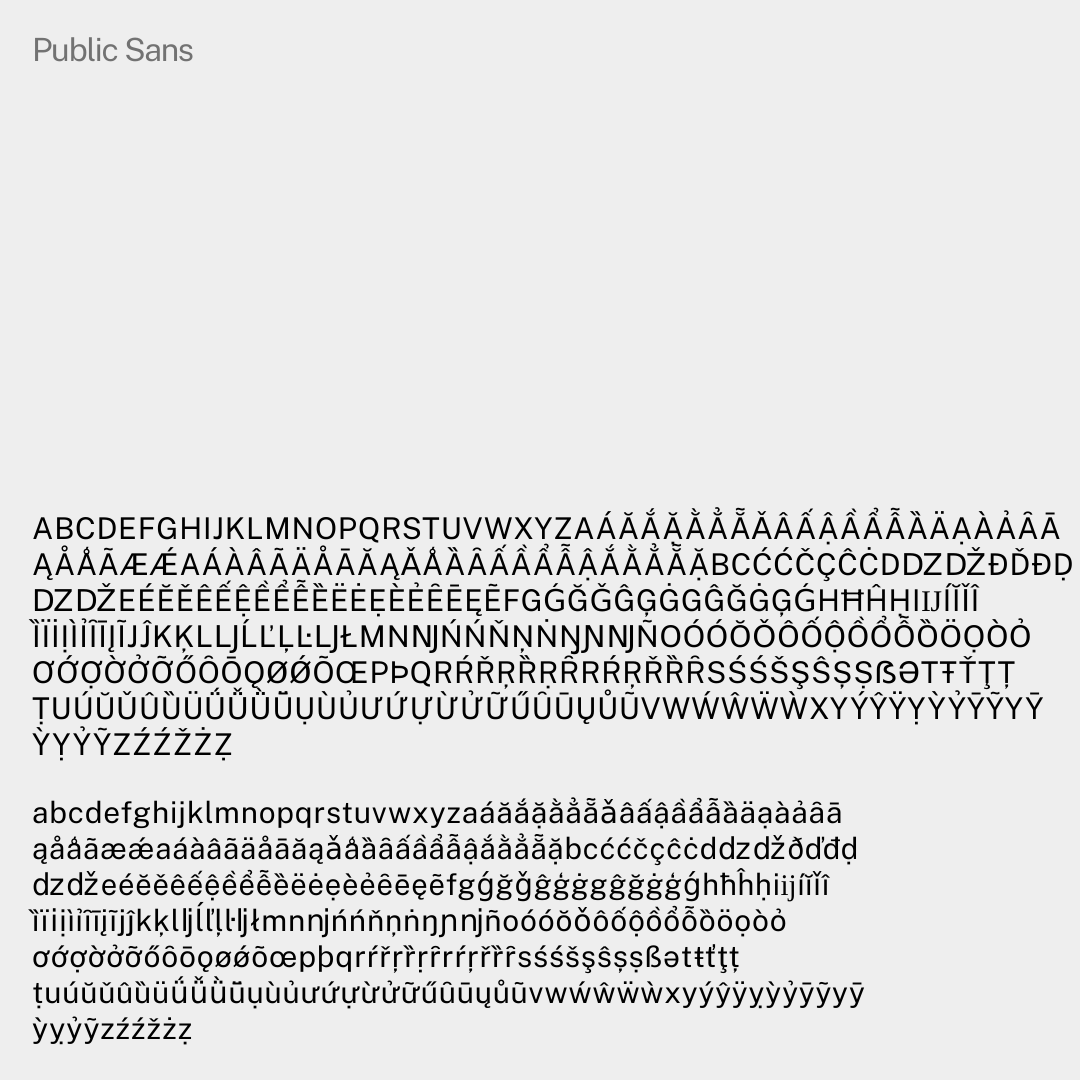
Public Sans
A font based off Libre Franklin (another great typeface choice available through Google Fonts) with a broad range. It’s neutral and adaptable font, performing well in headlines, long text, and UI.
Footnotes
-
According to pageview analytics! ↩